
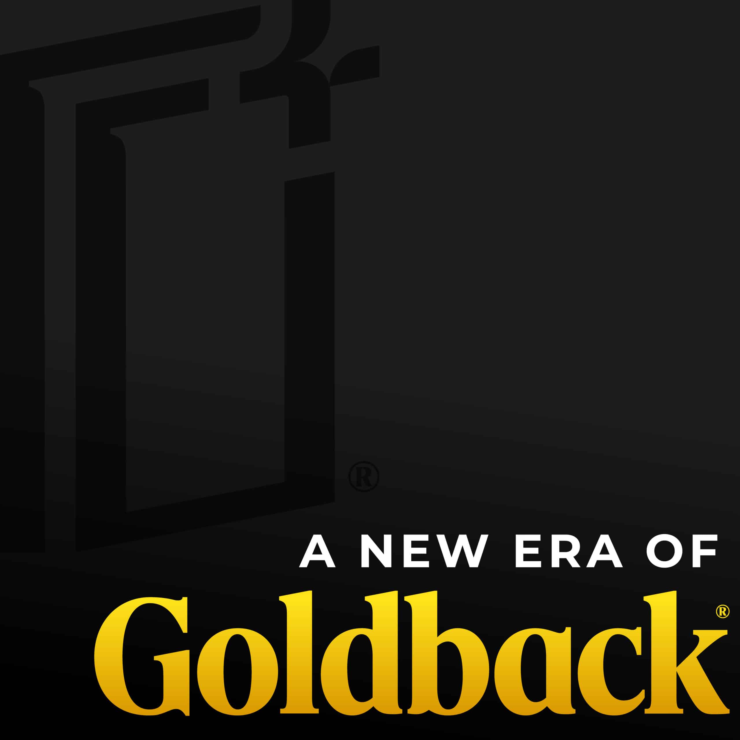
A New Logo for a New Era
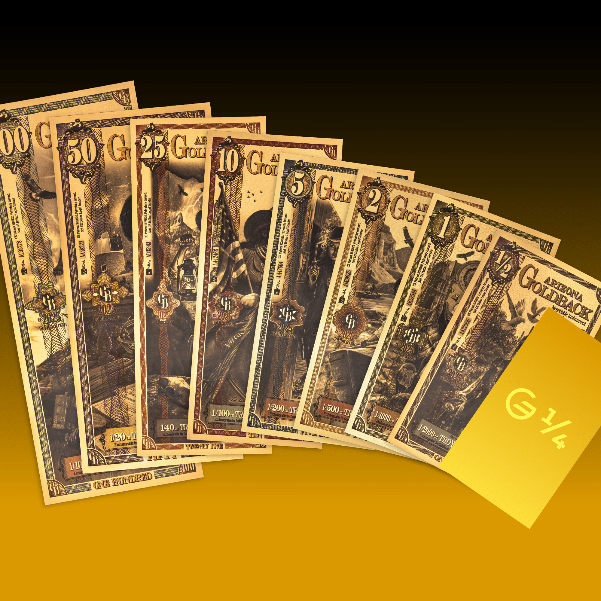
Recently, we announced the new 1/4 Goldback denomination. Creating the smallest Goldback denomination ever came with some unique challenges, pushing us to make improvements to our layout and wordmark. We wanted to ensure that every detail remained clear and legible, even at a smaller size and across different state series.
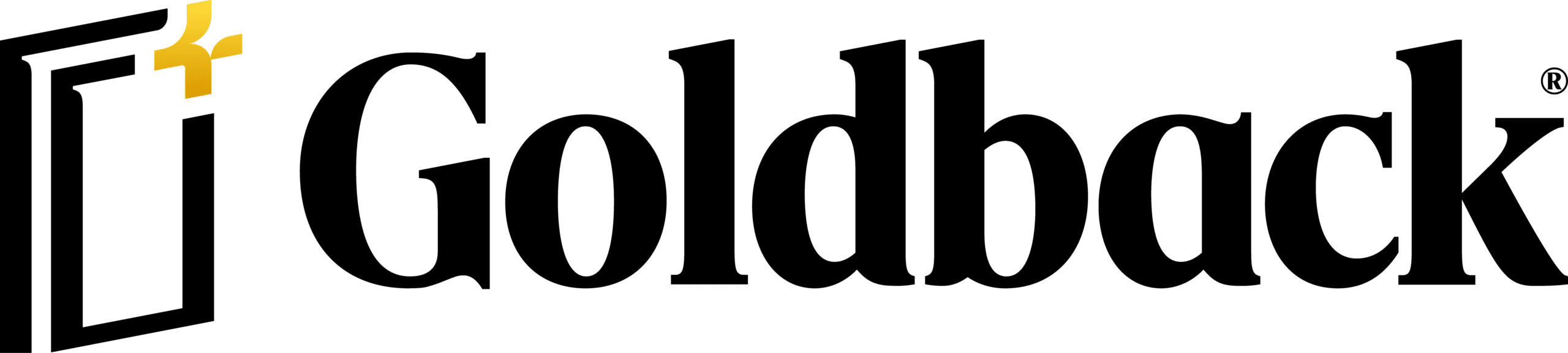
Today, we’re excited to unveil the new Goldback logo!
These updates support our goal to strengthen Goldback as a trustworthy, spendable gold currency of the future.
The New Logo
The new logo bridges two worlds: gold’s enduring history and the future of spendable, alternative currency.
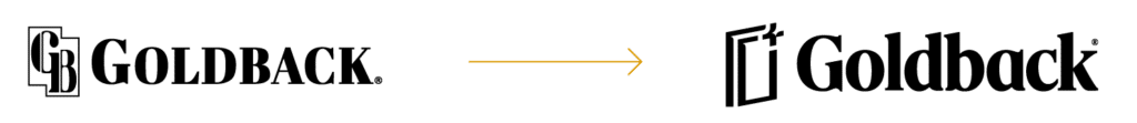
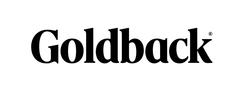
A CLEANER WORDMARK
The updated typeface is more legible and accessible. It’s designed to read clearly on all platforms, from Goldbacks themselves to packaging and screens. It feels approachable without being casual, and traditional without feeling stiff.
A MEANINGFUL ICON
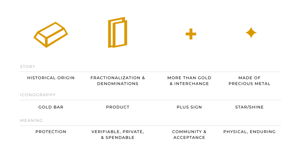
The new icon tells a simple, accurate story about what a Goldback is.
It represents:
- Fractional gold: designed for everyday exchange.
- Spendable form: not limited to long-term storage.
- 24K gold: real and verifiable.
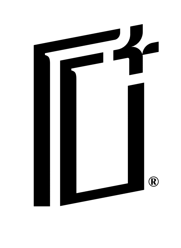
The icon exists to communicate utility at a glance. It helps answer a common question quickly: What am I holding, and how does it work as money?
Why the Updates?
Over the years, Goldback has evolved. What started as a bold idea—to make gold spendable again—has become a practical, proven currency used by real people everywhere.
Our mission remains the same: empower people of all income levels with a trustworthy gold currency. With these updates we can communicate that mission more clearly to the world.
We’d love for you to join us in this exciting new chapter and to continue taking part in our growing Goldback community!
Related Articles
A New Logo for a New Era
Recently, we announced the new 1/4 Goldback denomination. …
The 1/4 Goldback is Coming Soon!
We’re thrilled to announce that a new Goldback …
GILD Community Corner: 2025 Review and 2026 Goals!
Written by Phil Eborn, Director of Community Last …
Goldback 2025 Recap: Growth by the Numbers
2025 was a defining year for Goldback. We …